大家好,又见面了,我是你们的朋友全栈君。如果您正在找激活码,请点击查看最新教程,关注关注公众号 “全栈程序员社区” 获取激活教程,可能之前旧版本教程已经失效.最新Idea2022.1教程亲测有效,一键激活。
Jetbrains全系列IDE稳定放心使用
Qt之QCustomPlot概述
QCustomPlot使用手册(一)
QCustomPlot使用手册(二)
QCustomPlot使用手册(三)
QCustomPlot使用手册(四)
一、官网下载
从官网下载 qcustomplot.h 和 qcustomplot.cpp
QCustomPlot官网下载
官网函数手册Reference
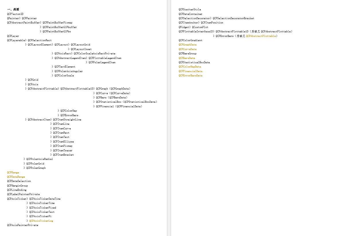
2.1版本类图:

二、加入工程
通过添加现有文件将 qcustomplot.h、qcustomplot.cpp加入工程,并在pro文件中加入printsupport

三、使用
1、静态生成(QT Designer 中 prompt 插件)
放置widget并提升为QCustomPlot,名称为myplot

点击添加按钮将QCustomPlot加入到提升类列表中,
点击提升按钮将widget提升为QCustomPlot类
2、画图
customPlot->xAxis, yAxis, xAxis2, and yAxis2分别是底、左、上、右的轴
设置轴的刻度数目:xAxis->ticker()->setTickCount(6)
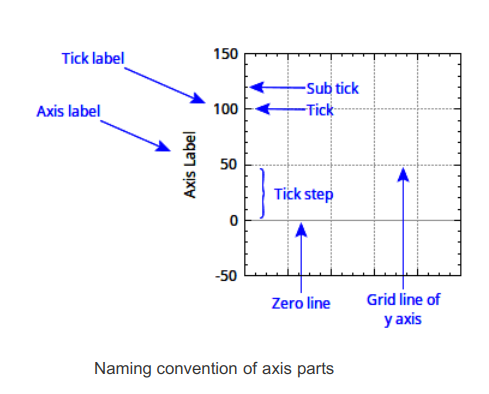
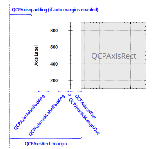
QCustomPlot使用心得五:坐标轴常用属性设置(这个好)
QCustomplot使用分享(六) 坐标轴和网格线
QCPAxisTicker坐标轴类(一)
QCustomPlot 曲线各种属性详细介绍
QCustomPlot 2.0.1类、函数思维导图
15.QCustomPlot数据结构
要在屏幕上显示对绘图的任何更改,调用 customPlot->replot() 。
请注意,replot 函数在当调整widget的大小并触发内置用户交互时,将自动发生重新绘制。比如:用户交互例、用鼠标拖动轴范围、用鼠标滚轮缩放。
// 产生数据
QVector<double> x(101), y(101); // initialize with entries 0..100
for (int i=0; i<101; ++i)
{

  x[i] = i/50.0 - 1; // x goes from -1 to 1
  y[i] = x[i]*x[i]; // let's plot a quadratic function
}
// create graph and assign data to it:
customPlot->addGraph();  //创建新图
customPlot->graph(0)->setData(x, y);//指定数据
// give the axes some labels:
customPlot->xAxis->setLabel("x");
customPlot->yAxis->setLabel("y");
// set axes ranges, so we see all data:
customPlot->xAxis->setRange(-1, 1);
customPlot->yAxis->setRange(0, 1);
customPlot->replot();//重绘,数据变化时调用

// period as decimal separator and comma as thousand separator
customPlot->setLocale(QLocale(QLocale::English, QLocale::UnitedKingdom));
customPlot->legend->setVisible(true);
QFont legendFont = font(); // start out with MainWindow's font..
legendFont.setPointSize(9); // and make a bit smaller for legend
customPlot->legend->setFont(legendFont);
customPlot->legend->setBrush(QBrush(QColor(255,255,255,230)));
// by default, the legend is in the inset layout of the main axis rect.
//So this is how we access it to change legend placement:
customPlot->axisRect()->insetLayout()->setInsetAlignment(0, Qt::AlignBottom|Qt::AlignRight);
// setup for graph 0: key axis left, value axis bottom
// will contain left maxwell-like function
customPlot->addGraph(customPlot->yAxis, customPlot->xAxis);
customPlot->graph(0)->setPen(QPen(QColor(255, 100, 0)));
customPlot->graph(0)->setBrush(QBrush(QPixmap("./balboa.jpg"))); // fill with texture of specified image
customPlot->graph(0)->setLineStyle(QCPGraph::lsLine);
customPlot->graph(0)->setScatterStyle(QCPScatterStyle(QCPScatterStyle::ssDisc, 5));
customPlot->graph(0)->setName("Left maxwell function");
// setup for graph 1: key axis bottom, value axis left (those are the default axes)
// will contain bottom maxwell-like function with error bars
customPlot->addGraph();
customPlot->graph(1)->setPen(QPen(Qt::red));
customPlot->graph(1)->setBrush(QBrush(QPixmap("./balboa.jpg"))); // same fill as we used for graph 0
customPlot->graph(1)->setLineStyle(QCPGraph::lsStepCenter);
customPlot->graph(1)->setScatterStyle(QCPScatterStyle(QCPScatterStyle::ssCircle, Qt::red, Qt::white, 7));
customPlot->graph(1)->setName("Bottom maxwell function");
QCPErrorBars *errorBars = new QCPErrorBars(customPlot->xAxis, customPlot->yAxis);
errorBars->removeFromLegend();
errorBars->setDataPlottable(customPlot->graph(1));
// setup for graph 2: key axis top, value axis right
// will contain high frequency sine with low frequency beating:
customPlot->addGraph(customPlot->xAxis2, customPlot->yAxis2);
customPlot->graph(2)->setPen(QPen(Qt::blue));
customPlot->graph(2)->setName("High frequency sine");
// setup for graph 3: same axes as graph 2
// will contain low frequency beating envelope of graph 2
customPlot->addGraph(customPlot->xAxis2, customPlot->yAxis2);
QPen blueDotPen;
blueDotPen.setColor(QColor(30, 40, 255, 150));
blueDotPen.setStyle(Qt::DotLine);
blueDotPen.setWidthF(4);
customPlot->graph(3)->setPen(blueDotPen);
customPlot->graph(3)->setName("Sine envelope");
// setup for graph 4: key axis right, value axis top
// will contain parabolically distributed data points with some random perturbance
customPlot->addGraph(customPlot->yAxis2, customPlot->xAxis2);
customPlot->graph(4)->setPen(QColor(50, 50, 50, 255));
customPlot->graph(4)->setLineStyle(QCPGraph::lsNone);
customPlot->graph(4)->setScatterStyle(QCPScatterStyle(QCPScatterStyle::ssCircle, 4));
customPlot->graph(4)->setName("Some random data around\na quadratic function");
// generate data, just playing with numbers, not much to learn here:
QVector<double> x0(25), y0(25);
QVector<double> x1(15), y1(15), y1err(15);
QVector<double> x2(250), y2(250);
QVector<double> x3(250), y3(250);
QVector<double> x4(250), y4(250);
for (int i=0; i<25; ++i) // data for graph 0
{
x0[i] = 3*i/25.0;
y0[i] = qExp(-x0[i]*x0[i]*0.8)*(x0[i]*x0[i]+x0[i]);
}
for (int i=0; i<15; ++i) // data for graph 1
{
x1[i] = 3*i/15.0;;
y1[i] = qExp(-x1[i]*x1[i])*(x1[i]*x1[i])*2.6;
y1err[i] = y1[i]*0.25;
}
for (int i=0; i<250; ++i) // data for graphs 2, 3 and 4
{
x2[i] = i/250.0*3*M_PI;
x3[i] = x2[i];
x4[i] = i/250.0*100-50;
y2[i] = qSin(x2[i]*12)*qCos(x2[i])*10;
y3[i] = qCos(x3[i])*10;
y4[i] = 0.01*x4[i]*x4[i] + 1.5*(rand()/(double)RAND_MAX-0.5) + 1.5*M_PI;
}
// pass data points to graphs:
customPlot->graph(0)->setData(x0, y0);
customPlot->graph(1)->setData(x1, y1);
errorBars->setData(y1err);
customPlot->graph(2)->setData(x2, y2);
customPlot->graph(3)->setData(x3, y3);
customPlot->graph(4)->setData(x4, y4);
// activate top and right axes, which are invisible by default:
customPlot->xAxis2->setVisible(true);
customPlot->yAxis2->setVisible(true);
// set ranges appropriate to show data:
customPlot->xAxis->setRange(0, 2.7);
customPlot->yAxis->setRange(0, 2.6);
customPlot->xAxis2->setRange(0, 3.0*M_PI);
customPlot->yAxis2->setRange(-70, 35);
// set pi ticks on top axis:
customPlot->xAxis2->setTicker(QSharedPointer<QCPAxisTickerPi>(new QCPAxisTickerPi));
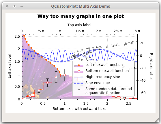
// add title layout element:
customPlot->plotLayout()->insertRow(0);
customPlot->plotLayout()->addElement(0, 0,
new QCPTextElement(customPlot, "Way too many graphs in one plot", QFont("sans", 12, QFont::Bold)));
// set labels:
customPlot->xAxis->setLabel("Bottom axis with outward ticks");
customPlot->yAxis->setLabel("Left axis label");
customPlot->xAxis2->setLabel("Top axis label");
customPlot->yAxis2->setLabel("Right axis label");
// make ticks on bottom axis go outward:
customPlot->xAxis->setTickLength(0, 5);
customPlot->xAxis->setSubTickLength(0, 3);
// make ticks on right axis go inward and outward:
customPlot->yAxis2->setTickLength(3, 3);
customPlot->yAxis2->setSubTickLength(1, 1);
// set locale to english, so we get english month names:
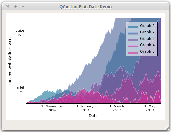
customPlot->setLocale(QLocale(QLocale::English, QLocale::UnitedKingdom));
// seconds of current time, we'll use it as starting point in time for data:
double now = QDateTime::currentDateTime().toTime_t();
srand(8); // set the random seed, so we always get the same random data
// create multiple graphs:
for (int gi=0; gi<5; ++gi)
{
customPlot->addGraph();
QColor color(20+200/4.0*gi,70*(1.6-gi/4.0), 150, 150);
customPlot->graph()->setLineStyle(QCPGraph::lsLine);
customPlot->graph()->setPen(QPen(color.lighter(200)));
customPlot->graph()->setBrush(QBrush(color));
// generate random walk data:
QVector<QCPGraphData> timeData(250);
for (int i=0; i<250; ++i)
{
timeData[i].key = now + 24*3600*i;
if (i == 0)
timeData[i].value = (i/50.0+1)*(rand()/(double)RAND_MAX-0.5);
else
timeData[i].value = qFabs(timeData[i-1].value)*(1+0.02/4.0*(4-gi)) + (i/50.0+1)*(rand()/(double)RAND_MAX-0.5);
}
customPlot->graph()->data()->set(timeData);
}
// configure bottom axis to show date instead of number:
QSharedPointer<QCPAxisTickerDateTime> dateTicker(new QCPAxisTickerDateTime);
dateTicker->setDateTimeFormat("d. MMMM\nyyyy");
customPlot->xAxis->setTicker(dateTicker);
// configure left axis text labels:
QSharedPointer<QCPAxisTickerText> textTicker(new QCPAxisTickerText);
textTicker->addTick(10, "a bit\nlow");
textTicker->addTick(50, "quite\nhigh");
customPlot->yAxis->setTicker(textTicker);
// set a more compact font size for bottom and left axis tick labels:
customPlot->xAxis->setTickLabelFont(QFont(QFont().family(), 8));
customPlot->yAxis->setTickLabelFont(QFont(QFont().family(), 8));
// set axis labels:
customPlot->xAxis->setLabel("Date");
customPlot->yAxis->setLabel("Random wobbly lines value");
// make top and right axes visible but without ticks and labels:
customPlot->xAxis2->setVisible(true);
customPlot->yAxis2->setVisible(true);
customPlot->xAxis2->setTicks(false);
customPlot->yAxis2->setTicks(false);
customPlot->xAxis2->setTickLabels(false);
customPlot->yAxis2->setTickLabels(false);
// set axis ranges to show all data:
customPlot->xAxis->setRange(now, now+24*3600*249);
customPlot->yAxis->setRange(0, 60);
// show legend with slightly transparent background brush:
customPlot->legend->setVisible(true);
customPlot->legend->setBrush(QColor(255, 255, 255, 150));
3、动态生成
	QWidget *paintArea = new QWidget;
    QCustomPlot *myPlot = new QCustomPlot(paintArea);
    myPlot->setFixedSize(480,300);
    //blue line
    myPlot->addGraph();
    myPlot->graph(0)->setPen(QPen(Qt::blue));
    //xAxis
    myPlot->axisRect()->setupFullAxesBox();
    myPlot->xAxis->setRange(1, 1, Qt::AlignRight);
    myPlot->yAxis->setRange(30, 30, Qt::AlignRight);
    myPlot->xAxis->setLabel("I(A)");
    myPlot->yAxis->setLabel("U(V)");
四、高级应用
QT5使用QCustomplot绘制频谱瀑布图并封快速傅里叶变换fft类
QCustomplot绘制实时波形图(频谱图、瀑布图、星座图)并开启opengl支持
QCustomplot系列文章(这个好)
QCustomPlot 绘制多条动态曲线性能测试
QCustomPlot 使用整理
5.QCustomPlot 创建动态轴标签(有系列文章)
12.QCustomPlot中数据选择机制(有系列文章)
QT应用编程: 使用qcustomplot显示动态曲线、设计心电图显示页面(有动态和数据指针)
1、1.0版本更新大数据
数据量少时,用setData() 和 addData()给图传数据(内部拷贝效率低);
数据量大时,用data()接口。
void addToDataBuffer(float x, float y)
{

    QCPData newData;
    newData.key = x;
    newData.value = y;

    QCPDataMap *mData = myPlot->graph(0)->data();
// mData->clear();//根据情况
    mData->insert(x, newData);
}
QCPDataMap 可以看做坐标横纵坐标的组合 (x,y), 用insert() 添加数据;如果需要key 对应多个值则使用 insertMulti( )往 buffer 里面添加数据。
画新曲线之前,先 clear() 一下 buffer ;更新数据后,replot() 一下。
2、2.0版本更新大数据
(1)传值法(直接调用无需修改QCustomplot)
下面是源码示例中更新数据方法,画图数据的核心是 mData,是一个 QCPGraphData 类型的 Vector,所以,我们直接构建这样一个 Vector,把内部的替换掉即可。可惜这里不是指针,函数内实现方式是用我们提供的 mData 给内部 mData 赋值,也就是,还是要进行一次拷贝。当然,你也可以去改它的代码把这个指针给放出来。
:
void MainWindow::addNewData()
{

    QSharedPointer< QCPGraphDataContainer > dataContainer;
    dataContainer = customplot->graph(0)->data();
    QVector<QCPGraphData> mData; //warning: it's a local var
    QCPGraphData newPoint;
    newPoint.key = 123;
    newPoint.value = 456;
    mData.append(newPoint);
    dataContainer->set(mData,true); //if the data has been sorted, set true
}
(2)指针法(需修改QCustomplot.h)
修改如下:
void MainWindow::mDataDirect(QCustomPlot *customPlot)
{

    demoName = "mData";
    customPlot->addGraph();
    QVector<QCPGraphData> *mData;
    mData = customPlot->graph(0)->data()->coreData();//自己添加获得指针的函数
    mData->clear();

    QCPGraphData newPoint;
    for (int i=0; i<101; ++i)
    {

        double tmp = i/50.0 - 1;
        newPoint.key = tmp;
        newPoint.value = tmp * tmp;  // let's plot a quadratic function
        mData->append(newPoint);
    }
    // give the axes some labels:
    customPlot->xAxis->setLabel("x");
    customPlot->yAxis->setLabel("y");
    // set axes ranges, so we see all data:
    customPlot->xAxis->setRange(-1, 1);
    customPlot->yAxis->setRange(0, 1);
}
在 qcustomplot.h 中加入myMethod这一行
  // setters:
  void setAutoSqueeze(bool enabled);

  // myMethod
  QVector<DataType>* coreData() {
   return &mData;}

  // non-virtual methods:
  void set(const QCPDataContainer<DataType> &data);
3、设置画图区域的背景色
	QBrush backRole;
    backRole.setColor("skyblue");
    backRole.setStyle(Qt::SolidPattern);//不加 SolidPattern,画出来的图是透明的
    myPlot->setBackground(backRole);
4、实时显示
qcustomplot实时滚动显示,内存释放删除数据
QCustomPlot实现实时动态曲线
QCustomPlot系列(5)-实时动态曲线
QCustomPlot系列
5、小例子
//设定背景为黑色
		//ui->widget->setBackground(QBrush(Qt::black));
        //设定右上角图形标注可见
        ui->widget->legend->setVisible(true);
        //设定右上角图形标注的字体
        ui->widget->legend->setFont(QFont("Helvetica", 9));
        QVector<double> x(101),y(101);
            //图形为y=x^3
            for(int i=0;i<101;i++)
            {

                x[i] = i/5.0-10;
                y[i] = x[i]*x[i]*x[i];//qPow(x[i],3)
            }
            //添加图形
            ui->widget->addGraph();
            //设置画笔
            ui->widget->graph(0)->setPen(QPen(Qt::blue));
            //设置画刷,曲线和X轴围成面积的颜色
             ui->widget->graph(0)->setBrush(QBrush(QColor(255,255,0)));
            //设置右上角图形标注名称
            ui->widget->graph(0)->setName("曲线");
            //传入数据,setData的两个参数类型为double
            ui->widget->graph(0)->setData(x,y);

            QVector<double> temp(20);
            QVector<double> temp1(20);
            //图形为y = 100*x;
            for(int i=0;i<20;i++)
            {

                temp[i] = i;
                temp1[i] = 10*i+10;
            }
            //添加图形
            ui->widget->addGraph();
            //设置画笔
            ui->widget->graph(1)->setPen(QPen(Qt::red));
            //设置画刷,曲线和X轴围成面积的颜色
            //ui->widget->graph(1)->setBrush(QBrush(QColor(0,255,0)));
            //传入数据
            ui->widget->graph(1)->setData(temp,temp1);

            /*-------------------------------------------*/
            //画动态曲线时,传入数据采用addData,通过定时器多次调用,并在之后调用ui->widget->replot();
            //动态曲线可以通过另一种设置坐标的方法解决坐标问题:
            //setRange ( double position, double size, Qt::AlignmentFlag alignment )
            //参数分别为:原点,偏移量,对其方式,有兴趣的读者可自行尝试,欢迎垂询
            /*-------------------------------------------*/

            //设置右上角图形标注名称
            ui->widget->graph(1)->setName("直线");
            //设置X轴文字标注
            ui->widget->xAxis->setLabel("time");
            //设置Y轴文字标注
            ui->widget->yAxis->setLabel("temp/shidu");
            //设置X轴坐标范围
            ui->widget->xAxis->setRange(-20,20);
            //设置Y轴坐标范围
            ui->widget->yAxis->setRange(-1100,1100);
            //在坐标轴右侧和上方画线,和X/Y轴一起形成一个矩形
            ui->widget->axisRect()->setupFullAxesBox();
6、刻度设置、鼠标显示数据
QCustomPlot之QCPAxisTicker坐标轴类
QCustomPlot绘制天气曲线图并动态显示曲线坐标值
QCustomPlot中用直线标示曲线的值
QCustomplot使用分享(九) 绘制图表-多功能游标
//设置坐标轴刻度
QVector<double> vTick;
QVector<QString> vTickLabel;
this->xAxis->setTickVector();
this->xAxis->setTickVectorLabels();
7、动态曲线及性能
QCustomPlot 动态曲线和绘图效率测试
项目记录 – Qt QCustomPlot 实时动态数据曲线图,以时间为X轴,数据为Y轴(二)
动态时间轴 2.0版本
1.0版本中设置时间轴
	//设置X轴时间刻度
	ui->customplot->xAxis->setTickLabelType(QCPAxis::ltDateTime);
	ui->customplot->xAxis->setDateTimeFormat("hh:mm:ss");
	ui->customplot->xAxis->setDateTimeSpec(Qt::LocalTime);
2.0版本中设置时间轴
	//设置X轴时间刻度
	QSharedPointer<QCPAxisTickerDateTime> dateTick(new QCPAxisTickerDateTime);
    dateTick->setDateTimeFormat("hh:mm:ss");
    ui->customplot->xAxis->setTicker(dateTick);
动态时间轴的关键步骤:
//秒中间插入数据的关键是有小数,不能直接 /1000,而是/1000.0
double t = (double)(QDateTime::currentMSecsSinceEpoch()) / 1000.0;
pGraph->addData(t, y);
//时间轴滚动
double curSeclf = QDateTime::currentDateTime().toMSecsSinceEpoch()/1000.0;
 //(double)(QDateTime::currentMSecsSinceEpoch()) / 1000.0;
this->xAxis->setRange(curSeclf + 0.25, 4, Qt::AlignRight);
this->replot();
//删除滚动出图表的数据
pGraph->data().data()->removeBefore(0);
Y轴作为时间轴进行滚动:
QCPGraph * addGraph(QCPAxis * keyAxis = 0, QCPAxis * valueAxis = 0)
this->addGraph(yAxis,xAxis);//y轴为key值,x轴为value
删除过期数据:
V1.x版本中是有removeDataBefore()的,可以删除之前的数据,但v2.x时,这个函数被取缔了,但它经常会在绘制动态图中用到,可修改QCustomPlot源码进行添加,在QCPGraph类中增加公有成员函数。
//qcustomplot.h中
void removeDataBefore(int size);

//qcustomplot.cpp中
void QCPGraph::removeDataBefore(int size)
{

    mDataContainer->removeBefore(mDataContainer->size()-size);
}
//获取时间ms的不同方法
int QTime::msecsSinceStartOfDay();
QDateTime::currentDateTime().toMesecsSince Epoch();
QTime curTime(QTime::currentTime());
int ms = curTime.hour()*60*60*1000+curTime.minute()*60*1000+curTime.second()*1000+curTime.msec();
8、坐标轴单位
Qt QcustomPlot 多条Y轴在垂直布局中对齐的方法
/* 上面代码使得Y轴轴线始终对齐,下面的代码使得Y轴的标签始终对齐 */
QCPItemText *DataAquisition::setYaxisLabel(QCPAxis *yAxis, QString label, QCPAxisRect *rect)
{

    QCPItemText* yAxisLabel = new QCPItemText(ui->customplot);
    yAxisLabel->setText(label);
    yAxisLabel->setRotation(90);
    yAxisLabel->position->setAxisRect(rect);
    yAxisLabel->setClipToAxisRect(false);
    //x is absolut position
    yAxisLabel->position->setTypeX(QCPItemPosition::ptAbsolute);
    //y is relativ to AxesRect
    yAxisLabel->position->setTypeY(QCPItemPosition::ptAxisRectRatio);
    yAxisLabel->position->setAxes(0, yAxis);
    yAxisLabel->position->setCoords(10, 0.5);

    return yAxisLabel;
}
9、缩放
QCustomPlot实现矩形缩放图表
QCustomPlot系列: 实现X轴,Y轴的单独滚轮缩放数据
.h文件
#ifndef CROWDATAPLOT_H
#define CROWDATAPLOT_H

#include <QWidget>
#include "qcustomplot.h"

class CRowDataPlot : public QCustomPlot
{

public:
    CRowDataPlot(QWidget * parent = nullptr);

private slots:
    void onMouseWheel();
};

#endif // CROWDATAPLOT_H
.cpp文件
#include "crowdataplot.h"
CRowDataPlot::CRowDataPlot(QWidget * parent) :QCustomPlot(parent)
{

    //--1 设置plot属性
    setInteractions(QCP::iRangeDrag|QCP::iRangeZoom| QCP::iSelectAxes
                                    |QCP::iSelectLegend | QCP::iSelectPlottables);
    //--2 连接鼠标滚轮信号和槽
    connect(this, &CRowDataPlot::mouseWheel, this, &CRowDataPlot::onMouseWheel);
}

void CRowDataPlot::onMouseWheel()
{

    if (xAxis->selectedParts().testFlag(QCPAxis::spAxis))
        axisRect()->setRangeZoom(xAxis->orientation());
    else if (yAxis->selectedParts().testFlag(QCPAxis::spAxis))
        axisRect()->setRangeZoom(yAxis->orientation());
    else
        axisRect()->setRangeZoom(Qt::Horizontal|Qt::Vertical);
}
10、画圆
使用QCPItemEllipse画圆
qcustomplot画圆
.h文件:
private:
    QCPItemEllipse *m_pCPItemEllipse;         //一个圆
    QCPItemEllipse **m_pCPItemEllipseArray;    //多个圆
.cpp文件:
	//一个圆
	m_pCPItemEllipse = new QCPItemEllipse(ui->customPlot);
	QPen pen(Qt::green, 3, Qt::DashDotLine, Qt::RoundCap, Qt::RoundJoin);
	m_pCPItemEllipse->setPen(pen);
	//圆心C(x, y) 半径r
	//tL(x-r, y+r) bR(x+r, y-r)
	m_pCPItemEllipse->topLeft->setCoords(-120, -80);      //左上角位置 tL
	m_pCPItemEllipse->bottomRight->setCoords(-80, -120);  //右下角位置 bR
	ui->routeShowWidget->replot();
	//多个圆
	int number = 3;
	m_pCPItemEllipseArray = new QCPItemEllipse *[number];
	for(int vsi = 0; vsi < number; vsi++)
	{

	    m_pCPItemEllipseArray[vsi] = new QCPItemEllipse(ui->customPlot);
	    m_pCPItemEllipseArray[vsi]->topLeft->setCoords(100 + 2 * vsi, 80);   //左上角位置 tL
	    m_pCPItemEllipseArray[vsi]->bottomRight->setCoords(80, 120);         //右下角位置 bR
	 }
	ui->routeShowWidget->replot();
11.游标
游标及鼠标跟踪显示数值
QCustomPlot 标记点和文本标签
12、切屏屏闪
解决办法就是在我们的qcustomplot.cpp文件中,找到一个函数void QCPPaintBufferGlFbo::draw(QCPPainter *painter) const函数,大约在899行。
在代码painter->drawImage(0, 0, mGlFrameBuffer->toImage());之前加上一下代码:
  if(QOpenGLContext::currentContext() != mGlContext.data())
  {

      mGlContext.data()->makeCurrent(mGlContext.data()->surface());
  }
发布者:全栈程序员-用户IM,转载请注明出处:https://javaforall.cn/181061.html原文链接:https://javaforall.cn
【正版授权,激活自己账号】: Jetbrains全家桶Ide使用,1年售后保障,每天仅需1毛
【官方授权 正版激活】: 官方授权 正版激活 支持Jetbrains家族下所有IDE 使用个人JB账号...