大家好,又见面了,我是你们的朋友全栈君。
http://blog.csdn.net/pipisorry/article/details/40005163
Matplotlib.pyplot绘图实例
Gallery页面中有上百幅缩略图,打开之后都有源程序。
{使用pyplot模块}
绘制直线、条形/矩形区域
import numpy as np
import matplotlib.pyplot as plt
t = np.arange(-1, 2, .01)
s = np.sin(2 * np.pi * t)

plt.plot(t,s)
# draw a thick red hline at y=0 that spans the xrange
l = plt.axhline(linewidth=4, color='r')
plt.axis([-1, 2, -1, 2])
plt.show()
plt.close()

# draw a default hline at y=1 that spans the xrange
plt.plot(t,s)
l = plt.axhline(y=1, color='b')
plt.axis([-1, 2, -1, 2])
plt.show()
plt.close()

# draw a thick blue vline at x=0 that spans the upper quadrant of the yrange
plt.plot(t,s)
l = plt.axvline(x=0, ymin=0, linewidth=4, color='b')
plt.axis([-1, 2, -1, 2])
plt.show()
plt.close()

# draw a default hline at y=.5 that spans the the middle half of the axes
plt.plot(t,s)
l = plt.axhline(y=.5, xmin=0.25, xmax=0.75)
plt.axis([-1, 2, -1, 2])
plt.show()
plt.close()

plt.plot(t,s)
p = plt.axhspan(0.25, 0.75, facecolor='0.5', alpha=0.5)
p = plt.axvspan(1.25, 1.55, facecolor='g', alpha=0.5)
plt.axis([-1, 2, -1, 2])
plt.show()
效果图展示


Note: 设置直线对应位置的值显示:plt.text(max_x, 0, str(round(max_x, 2))),也就是直接在指定坐标写文字,不知道有没有其它方法?
另一种绘制直线的方式
plt.hlines(hline, xmin=plt.gca().get_xlim()[0], xmax=plt.gca().get_xlim()[1], linestyles=line_style, colors=color)在matplotlib中的一个坐标轴上画一条直线光标
matplotlib.widgets.Cursor
# set useblit = True on gtkagg for enhanced performance
# horizOn=True时,两个坐标都有显示光标
示例
import numpy as np
import matplotlib.pyplot as plt
from matplotlib.widgets import Cursor

t = np.arange(0.0, 2.0, 0.01)
s1 = np.sin(2 * np.pi * t)
plt.plot(t, s1)

cursor = Cursor(plt.gca(), horizOn=True, color='r', lw=1)
plt.show()
Note: 一个神奇的事情就是,Cursor()必须有一个赋值给cursor,否则并不会显示光标(ubuntu16.04下)。之前在windows下绘制时不用赋值也是会有光标显示的。
结果示图(随着光标的移动,在图中x坐标上会画一条竖线,并在下方显示坐标):

同时在两个子图的两个坐标轴之间画一条直线光标
import numpy as np
import matplotlib.pyplot as plt
from matplotlib.widgets import MultiCursor

t = np.arange(0.0, 2.0, 0.01)
s1 = np.sin(2*np.pi*t)
s2 = np.sin(4*np.pi*t)
fig = plt.figure()
ax1 = fig.add_subplot(211)
ax1.plot(t, s1)


ax2 = fig.add_subplot(212, sharex=ax1)
ax2.plot(t, s2)

multi = MultiCursor(fig.canvas, (ax1, ax2), color='r', lw=1)
plt.show()

[widgets example code: multicursor.py]
直方图hist
plt.hist(songs_plays, bins=50,range=(0, 50000), color='lightblue',density=True)Note: density是将y坐标按比例绘图,而不是数目。

hist转换成plot折线图
plt.hist直接绘制数据是hist图
plt.hist(z, bins=500, normed=True)hist图转换成折线图
cnts, bins = np.histogram(z, bins=500, normed=True)
bins = (bins[:-1] + bins[1:]) / 2
plt.plot(bins, cnts)[numpy教程 – 统计函数:histogram]
柱状图bar
用每根柱子的长度表示值的大小,它们通常用来比较两组或多组值。
bar()的第一个参数为每根柱子左边缘的横坐标;第二个参数为每根柱子的高度;第三个参数指定所有柱子的宽度,当第三个参数为序列时,可以为每根柱子指定宽度。
bar()不自动修改颜色。
示例1:
import numpy as np
import matplotlib.pyplot as plt
label_list = [100, 101, 200, 201, 900, 901]
cnt_list = [2520, 7491, 35411, 2407, 54556, 6254]
plt.bar(range(len(cnt_list)), cnt_list, label=’label cnt’, color=’steelblue’, alpha=1.0, width=0.8)
plt.xticks(np.arange(len(label_list)), labels=label_list)
plt.legend()
plt.show()

示例2:
n = np.array([0,1,2,3,4,5])
x = np.linspace(-0.75, 1., 100)

fig, axes = plt.subplots(1, 4, figsize=(12,3))

axes[0].scatter(x, x + 0.25*np.random.randn(len(x)))

axes[1].step(n, n**2, lw=2)

axes[2].bar(n, n**2, align="center", width=0.5, alpha=0.5)

axes[3].fill_between(x, x**2, x**3, color="green", alpha=0.5);
Note: axes子图设置title: axes.set_title(“bar plot”)
分组条形图
import matplotlib.pyplot as plt
import numpy as np
# 构建数据
Y2016 = [15600,12700,11300,4270,3620]
Y2017 = [17400,14800,12000,5200,4020]
labels = ['北京','上海','香港','深圳','广州']
bar_width = 0.45

# 中文乱码的处理
plt.rcParams['font.sans-serif'] =['Microsoft YaHei']
plt.rcParams['axes.unicode_minus'] = False

# 绘图
plt.bar(np.arange(5), Y2016, label = '2016', color = 'steelblue', alpha = 0.8, width = bar_width)
plt.bar(np.arange(5)+bar_width, Y2017, label = '2017', color = 'indianred', alpha = 0.8, width = bar_width)

plt.xlabel('Top5城市')
plt.ylabel('家庭数量')
plt.title('亿万财富家庭数Top5城市分布')
plt.xticks(np.arange(5)+bar_width,labels)
plt.ylim([2500, 19000])

# 为每个条形图添加数值标签
for x2016,y2016 in enumerate(Y2016):
    plt.text(x2016, y2016+100, '%s' %y2016)

for x2017,y2017 in enumerate(Y2017):
    plt.text(x2017+bar_width, y2017+100, '%s' %y2017)

plt.legend()
plt.show()
垂直堆叠条形图
import matplotlib.pyplot as plt
import numpy as np
import pandas as pd

data = pd.read_excel('C:\\Users\\Administrator\\Desktop\\货运.xls')

# 绘图
plt.bar(np.arange(8), data.loc[0,:][1:], color = 'red', alpha = 0.8, label = '铁路', align = 'center')
plt.bar(np.arange(8), data.loc[1,:][1:],  bottom = data.loc[0,:][1:], color = 'green', alpha = 0.8, label = '公路', align = 'center')
plt.bar(np.arange(8), data.loc[2,:][1:],  bottom = data.loc[0,:][1:]+data.loc[1,:][1:], color = 'm', alpha = 0.8, label = '水运', align = 'center')
plt.bar(np.arange(8), data.loc[3,:][1:],  bottom = data.loc[0,:][1:]+data.loc[1,:][1:]+data.loc[2,:][1:], color = 'black', alpha = 0.8, label = '民航', align = 'center')

plt.xlabel('月份')
plt.ylabel('货物量(万吨)')
plt.title('2017年各月份物流运输量')
plt.xticks(np.arange(8),data.columns[1:])
plt.ylim([0,500000])

# 为每个条形图添加数值标签
for x_t,y_t in enumerate(data.loc[0,:][1:]):
    plt.text(x_t,y_t/2,'%sW' %(round(y_t/10000,2)),ha='center', color = 'white')

for x_g,y_g in enumerate(data.loc[0,:][1:]+data.loc[1,:][1:]):
    plt.text(x_g,y_g/2,'%sW' %(round(y_g/10000,2)),ha='center', color = 'white')

for x_s,y_s in enumerate(data.loc[0,:][1:]+data.loc[1,:][1:]+data.loc[2,:][1:]):
    plt.text(x_s,y_s-20000,'%sW' %(round(y_s/10000,2)),ha='center', color = 'white')

plt.legend(loc='upper center', ncol=4)
plt.show()
饼图pie
plt.figure(figsize=(6,9)) #调节图形大小
labels = [u’大型’,u’中型’,u’小型’,u’微型’] #定义标签
sizes = [46,253,321,66] #每块值
colors = [‘red’,’yellowgreen’,’lightskyblue’,’yellow’] #每块颜色定义
explode = (0,0,0.02,0) #将某一块分割出来,值越大分割出的间隙越大
patches,text1,text2 = plt.pie(sizes,
explode=explode,
labels=labels,
colors=colors,
autopct = ‘%3.2f%%’, #数值保留固定小数位
shadow = True, #阴影设置
startangle =90, #逆时针起始角度设置
pctdistance = 0.6) #数值距圆心半径倍数的距离
#patches饼图的返回值,texts1饼图外label的文本,texts2饼图内部的文本
# x,y轴刻度设置一致,保证饼图为圆形
plt.axis(‘equal’)
plt.show()

[Basic pie chart¶]
matplotlib 绘制盒状图(Boxplots)和小提琴图(Violinplots)
盒状图
import matplotlib.pyplot as plt
import numpy as np
all_data = [np.random.normal(0, std, 100) for std in range(1, 4)]
fig = plt.figure(figsize=(8,6))
plt.boxplot(all_data,
notch=False, # box instead of notch shape
sym=’rs’, # red squares for outliers
vert=True) # vertical box aligmnent
plt.xticks([y+1 for y in range(len(all_data))], [‘x1’, ‘x2’, ‘x3’])
plt.xlabel(‘measurement x’)
t = plt.title(‘Box plot’)
plt.show()
小提琴图
plt.violinplot(all_data,
showmeans=False,
showmedians=True
)
[matplotlib 绘制盒状图(Boxplots)和小提琴图(Violinplots)]
散列图scatter()
使用plot()绘图时,如果指定样式参数为仅绘制数据点,那么所绘制的就是一幅散列图。但是这种方法所绘制的点无法单独指定颜色和大小。
scatter()所绘制的散列图却可以指定每个点的颜色和大小。
scatter()的前两个参数是数组,分别指定每个点的X轴和Y轴的坐标。
s参数指定点的大 小,值和点的面积成正比。它可以是一个数,指定所有点的大小;也可以是数组,分别对每个点指定大小。
c参数指定每个点的颜色,可以是数值或数组。这里使用一维数组为每个点指定了一个数值。通过颜色映射表,每个数值都会与一个颜色相对应。默认的颜色映射表中蓝色与最小值对应,红色与最大值对应。当c参数是形状为(N,3)或(N,4)的二维数组时,则直接表示每个点的RGB颜色。
marker参数设置点的形状,可以是个表示形状的字符串,也可以是表示多边形的两个元素的元组,第一个元素表示多边形的边数,第二个元素表示多边形的样式,取值范围为0、1、2、3。0表示多边形,1表示星形,2表示放射形,3表示忽略边数而显示为圆形。
alpha参数设置点的透明度。
lw参数设置线宽,lw是line width的缩写。
facecolors参数为“none”时,表示散列点没有填充色。
散点图(改变颜色,大小)
import numpy as np import matplotlib.pyplot as plt
N = 50
x = np.random.rand(N)
y = np.random.rand(N)
area = np.pi * (15 * np.random.rand(N))**2 # 0 to 15 point radiuses
color = 2 * np.pi * np.random.rand(N)
plt.scatter(x, y, s=area, c=color, alpha=0.5, cmap=plt.cm.hsv)
plt.show()

matplotlib绘制散点图给点加上注释
plt.scatter(data_arr[:, 0], data_arr[:, 1], c=class_labels)
for i, class_label in enumerate(class_labels):
plt.annotate(class_label, (data_arr[:, 0][i], data_arr[:, 1][i]))[matplotlib scatter plot with different text at each data point]
对数坐标图
plot()所绘制图表的X-Y轴坐标都是算术坐标。
绘制对数坐标图的函数有三个:semilogx()、semilogy()和loglog(),它们分别绘制X轴为对数坐标、Y轴为对数坐标以及两个轴都为对数坐标时的图表。
下面的程序使用4种不同的坐标系绘制低通滤波器的频率响应曲线。
其中,左上图为plot()绘制的算术坐标系,右上图为semilogx()绘制的X轴对数坐标系,左下图 为semilogy()绘制的Y轴对数坐标系,右下图为loglog()绘制的双对数坐标系。使用双对数坐标系表示的频率响应曲线通常被称为波特图。
import numpy as np
import matplotlib.pyplot as plt
w = np.linspace(0.1, 1000, 1000)
p = np.abs(1/(1+0.1j*w)) # 计算低通滤波器的频率响应
plt.subplot(221)
plt.plot(w, p, linewidth=2)
plt.ylim(0,1.5)
plt.subplot(222)
plt.semilogx(w, p, linewidth=2)
plt.ylim(0,1.5)
plt.subplot(223)
plt.semilogy(w, p, linewidth=2)
plt.ylim(0,1.5)
plt.subplot(224)
plt.loglog(w, p, linewidth=2)
plt.ylim(0,1.5)
plt.show()
极坐标图
极坐标系是和笛卡尔(X-Y)坐标系完全不同的坐标系,极坐标系中的点由一个夹角和一段相对中心点的距离来表示。polar(theta, r, **kwargs)
可以polar()直接创建极坐标子图并在其中绘制曲线。也可以使用程序中调用subplot()创建子图时通过设 polar参数为True,创建一个极坐标子图,然后调用plot()在极坐标子图中绘图。
示例1
fig = plt.figure()
ax = fig.add_axes([0.0, 0.0, .6, .6], polar=True)
t = linspace(0, 2 * pi, 100)
ax.plot(t, t, color=’blue’, lw=3);

示例2
import numpy as np
import matplotlib.pyplot as plt
theta = np.arange(0, 2*np.pi, 0.02)
plt.subplot(121, polar=True)
plt.plot(theta, 1.6*np.ones_like(theta), linewidth=2) #绘制同心圆
plt.plot(3*theta, theta/3, “–“, linewidth=2)
plt.subplot(122, polar=True)
plt.plot(theta, 1.4*np.cos(5*theta), “–“, linewidth=2)
plt.plot(theta, 1.8*np.cos(4*theta), linewidth=2)
plt.rgrids(np.arange(0.5, 2, 0.5), angle=45)
plt.thetagrids([0, 45])
plt.show()
Note:rgrids()设置同心圆栅格的半径大小和文字标注的角度。因此右图中的虚线圆圈有三个, 半径分别为0.5、1.0和1.5,这些文字沿着45°线排列。
Thetagrids()设置放射线栅格的角度, 因此右图中只有两条放射线,角度分别为0°和45°。

[matplotlib.pyplot.polar(*args, **kwargs)]
等值线图
使用等值线图表示二元函数z=f(x,y)
所谓等值线,是指由函数值相等的各点连成的平滑曲线。等值线可以直观地表示二元函数值的变化趋势,例如等值线密集的地方表示函数值在此处的变化较大。
matplotlib中可以使用contour()和contourf()描绘等值线,它们的区别是:contourf()所得到的是带填充效果的等值线。
import numpy as np
import matplotlib.pyplot as plt
y, x = np.ogrid[-2:2:200j, -3:3:300j]
z = x * np.exp( – x**2 – y**2)
extent = [np.min(x), np.max(x), np.min(y), np.max(y)]
plt.figure(figsize=(10,4))
plt.subplot(121)
cs = plt.contour(z, 10, extent=extent)
plt.clabel(cs)
plt.subplot(122)
plt.contourf(x.reshape(-1), y.reshape(-1), z, 20)
plt.show()
为了更淸楚地区分X轴和Y轴,这里让它们的取值范围和等分次数均不相同.这样得 到的数组z的形状为(200, 300),它的第0轴对应Y轴、第1轴对应X轴。
调用contour()绘制数组z的等值线图,第二个参数为10,表示将整个函数的取值范围等分为10个区间,即显示的等值线图中将有9条等值线。可以使用extent参数指定等值线图的X轴和Y轴的数据范围。
contour()所返回的是一个QuadContourSet对象, 将它传递给clabel(),为其中的等值线标上对应的值。
调用contourf(),绘制将取值范围等分为20份、带填充效果的等值线图。这里演示了另外一种设置X、Y轴取值范围的方法,它的前两个参数分别是计算数组z时所使用的X轴和Y轴上的取样点,这两个数组必须是一维的。
使用等值线绘制隐函数f(x,y)=0曲线
显然,无法像绘制一般函数那样,先创建一个等差数组表示变量的取值点,然后计算出数组中每个x所对应的y值。
可以使用等值线解决这个问题,显然隐函数的曲线就是值等于0的那条等值线。
程序绘制函数在f(x,y)=0和 f(x,y)-0.1 = 0时的曲线。
import numpy as np
import matplotlib.pyplot as plt
y, x = np.ogrid[-1.5:1.5:200j, -1.5:1.5:200j]
f = (x**2 + y**2)**4 – (x**2 – y**2)**2
plt.figure(figsize=(9,4))
plt.subplot(121)
extent = [np.min(x), np.max(x), np.min(y), np.max(y)]
cs = plt.contour(f, extent=extent, levels=[0, 0.1], colors=[“b”, “r”], linestyles=[“solid”, “dashed”], linewidths=[2, 2])
plt.subplot(122)
for c in cs.collections:
data = c.get_paths()[0].vertices
plt.plot(data[:,0], data[:,1], color=c.get_color()[0], linewidth=c.get_linewidth()[0])
plt.show()

contour() levels参数指定所绘制等值线对应的函数值,这里设置levels参数为[0,0.1],因此最终将绘制两条等值线。
观察图会发现,表示隐函数f(x)=0蓝色实线并不是完全连续的,在图的中间部分它由许多孤立的小段构成。因为等值线在原点附近无限靠近,因此无论对函数f的取值空间如何进行细分,总是会有无法分开的地方,最终造成了图中的那些孤立的细小区域。
而表示隐函数f(x,y)=0的红色虚线则是闭合且连续的。
contour()返回对象QuadContourSet
可以通过contour()返回对象获得等值线上每点的数据,下面我们在IPython中观察变量cs,它是一个 QuadContourSet 对象:
cs对象的collections属性是一个等值线列表,每条等值线用一个LineCollection对象表示:
>>> cs.collections
<a list of 2 collections.LineCollection objects>
每个LineCollection对象都有它自己的颜色、线型、线宽等属性,注意这些属性所获得的结果外面还有一层封装,要获得其第0个元素才是真正的配置:
>>> c0.get_color()[0]
array([ 0., 0., 1., 1.])
>>> c0.get_linewidth()[0]
2
由类名可知,LineCollection对象是一组曲线的集合,因此它可以表示像蓝色实线那样由多条线构成的等值线。它的get_paths()方法获得构成等值线的所有路径,本例中蓝色实线
所表示的等值线由42条路径构成:
>>> len(cs.collections[0].get_paths())
42
路径是一个Path对象,通过它的vertices属性可以获得路径上所有点的坐标:
>>> path = cs.collections[0].get_paths()[0]
>>> type(path)
<class ‘matplotlib.path.Path’>
>>> path.vertices
array([[-0.08291457, -0.98938936],
[-0.09039269, -0.98743719],
…,
[-0.08291457, -0.98938936]])
上面的程序plt.subplot(122)就是从等值线集合cs中找到表示等值线的路径,并使用plot()将其绘制出来。
Matplotlib.pylab绘图实例
{使用pylab模块}
matplotlib还提供了一个名为pylab的模块,其中包括了许多NumPy和pyplot模块中常用的函数,方便用户快速进行计算和绘图,十分适合在IPython交互式环境中使用。这里使用下面的方式载入pylab模块:
>>> import pylab as pl
Note:import pyplot as plt也同样可以
两种常用图类型
Line and scatter plots(使用plot()命令), histogram(使用hist()命令)
1 折线图&散点图 Line and scatter plots
折线图 Line plots(关联一组x和y值的直线)
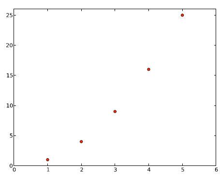
import pylab as pl

x = [1, 2, 3, 4, 5]# Make an array of x values
y = [1, 4, 9, 16, 25]# Make an array of y values for each x value

pl.plot(x, y)# use pylab to plot x and y
pl.show()# show the plot on the screen
plot(x, y) # plot x and y using default line style and colorplot(x, y, 'bo') # plot x and y using blue circle markersplot(y) # plot y using x as index array 0..N-1plot(y, 'r+') # ditto, but with red plussesplt.plot(ks, wssses, marker='*', markerfacecolor='r', linestyle='-', color='b')散点图 Scatter plots
把pl.plot(x, y)改成pl.plot(x, y, ‘o’)
美化 Making things look pretty
线条颜色 Changing the line color
红色:把pl.plot(x, y, ‘o’)改成pl.plot(x, y, ’or’)
线条样式 Changing the line style
虚线:plot(x,y, ‘–‘)
marker样式 Changing the marker style
蓝色星型markers:plot(x,y, ’b*’)
具体见附录 – matplotlib中的作图参数
图和轴标题以及轴坐标限度 Plot and axis titles and limits
import numpy as np
import pylab as pl
x = [1, 2, 3, 4, 5]# Make an array of x values
y = [1, 4, 9, 16, 25]# Make an array of y values for each x value
pl.plot(x, y)# use pylab to plot x and y
pl.title(’Plot of y vs. x’)# give plot a title
pl.xlabel(’x axis’)# make axis labels
pl.ylabel(’y axis’)
pl.xlim(0.0, 7.0)# set axis limits
pl.ylim(0.0, 30.)
pl.show()# show the plot on the screen

一个坐标系上绘制多个图 Plotting more than one plot on the same set of axes
依次作图即可
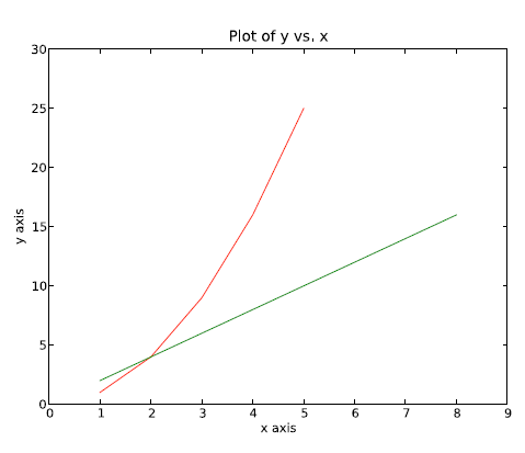
import numpy as np
import pylab as pl
x1 = [1, 2, 3, 4, 5]
y1 = [1, 4, 9, 16, 25]
x2 = [1, 2, 4, 6, 8]
y2 = [2, 4, 8, 12, 16]
pl.plot(x1, y1, ’r’)
pl.plot(x2, y2, ’g’)
pl.title(’Plot of y vs. x’)
pl.xlabel(’x axis’)
pl.ylabel(’y axis’)
pl.xlim(0.0, 9.0)# set axis limits
pl.ylim(0.0, 30.)
pl.show()
图例 Figure legends
pl.legend((plot1, plot2), (’label1, label2’),loc=‘best’, numpoints=1)
第三个参数loc=表示图例放置的位置:’best’‘upper right’, ‘upper left’, ‘center’, ‘lower left’, ‘lower right’.如果在当前figure里plot的时候已经指定了label,如plt.plot(x,z,label=”cos(x2)”),直接调用plt.legend()就可以了。
import pylab as pl

x1 = [1, 2, 3, 4, 5]  # Make x, y arrays for each graph
y1 = [1, 4, 9, 16, 25]
x2 = [1, 2, 4, 6, 8]
y2 = [2, 4, 8, 12, 16]

plot1 = pl.plot(x1, y1, 'r')  # use pylab to plot x and y : Give your plots names
plot2 = pl.plot(x2, y2, 'go')

pl.title('Plot of y vs. x')  # give plot a title
pl.xlabel('x axis')  # make axis labels
pl.ylabel('y axis')

pl.xlim(0.0, 9.0)  # set axis limits
pl.ylim(0.0, 30.)

pl.legend([plot1, plot2], ('red line', 'green circles'), 'best', numpoints=1)  # make legend
pl.show()  # show the plot on the screen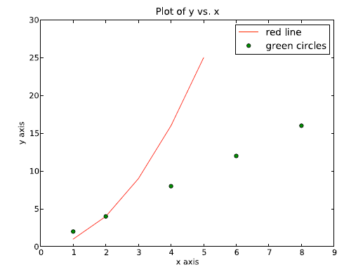
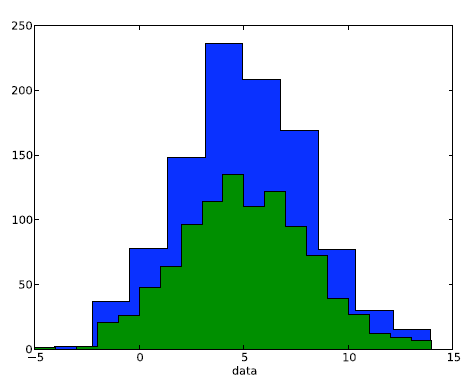
2 直方图 Histograms
import numpy as np
import pylab as pl

# make an array of random numbers with a gaussian distribution with
# mean = 5.0
# rms = 3.0
# number of points = 1000
data = np.random.normal(5.0, 3.0, 1000)

# make a histogram of the data array
pl.hist(data)

# make plot labels
pl.xlabel('data')
pl.show()
如果不想要黑色轮廓可以改为pl.hist(data, histtype=’stepfilled’)
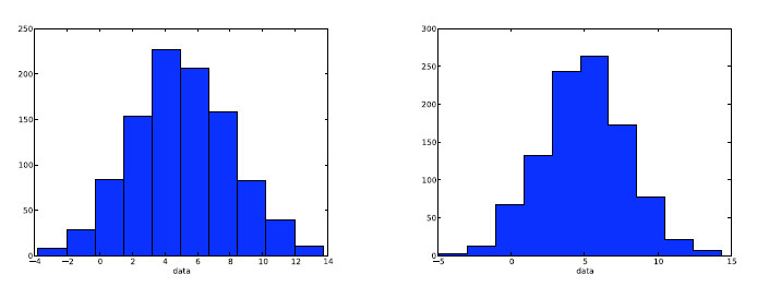
自定义直方图bin宽度 Setting the width of the histogram bins manually
增加两行
bins = np.arange(-5., 16., 1.) #浮点数版本的range
pl.hist(data, bins, histtype=’stepfilled’)
绘制
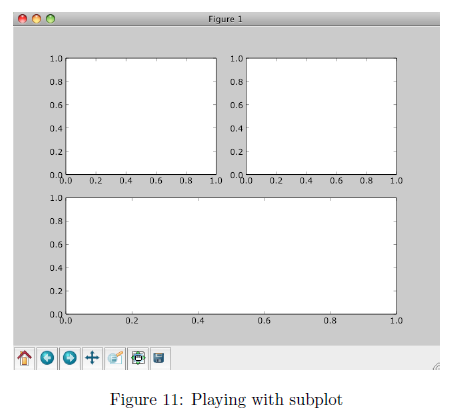
同一画板上绘制多幅子图 Plotting more than one axis per canvas
如果需要同时绘制多幅图表的话,可以是给figure传递一个整数参数指定图标的序号,如果所指定
序号的绘图对象已经存在的话,将不创建新的对象,而只是让它成为当前绘图对象。
fig1 = pl.figure(1)
pl.subplot(211)
subplot(211)把绘图区域等分为2行*1列共两个区域, 然后在区域1(上区域)中创建一个轴对象. pl.subplot(212)在区域2(下区域)创建一个轴对象。

You can play around with plotting a variety of layouts. For example, Fig. 11 is created using the following commands:
f1 = pl.figure(1)
pl.subplot(221)
pl.subplot(222)
pl.subplot(212)
当绘图对象中有多个轴的时候,可以通过工具栏中的Configure Subplots按钮,交互式地调节轴之间的间距和轴与边框之间的距离。如果希望在程序中调节的话,可以调用subplots_adjust函数,它有left, right, bottom, top, wspace, hspace等几个关键字参数,这些参数的值都是0到1之间的小数,它们是以绘图区域的宽高为1进行正规化之后的坐标或者长度。
pl.subplots_adjust(left=0.08, right=0.95, wspace=0.25, hspace=0.45)
给一些特殊点做注释
我们希望在 2π/3的位置给两条函数曲线加上一个注释。首先,我们在对应的函数图像位置上画一个点;然后,向横轴引一条垂线,以虚线标记;最后,写上标签。
1 2 3 4 5 6 7 8 9 10 11 12 13 14 15 16 17 18 19 |
...

t = 2*np.pi/3
plot([t,t],[0,np.cos(t)], color ='blue', linewidth=2.5, linestyle="--")
scatter([t,],[np.cos(t),], 50, color ='blue')

annotate(r'$\sin(\frac{2\pi}{3})=\frac{\sqrt{3}}{2}$',
         xy=(t, np.sin(t)), xycoords='data',
         xytext=(+10, +30), textcoords='offset points', fontsize=16,
         arrowprops=dict(arrowstyle="->", connectionstyle="arc3,rad=.2"))

plot([t,t],[0,np.sin(t)], color ='red', linewidth=2.5, linestyle="--")
scatter([t,],[np.sin(t),], 50, color ='red')

annotate(r'$\cos(\frac{2\pi}{3})=-\frac{1}{2}$',
         xy=(t, np.cos(t)), xycoords='data',
         xytext=(-90, -50), textcoords='offset points', fontsize=16,
         arrowprops=dict(arrowstyle="->", connectionstyle="arc3,rad=.2"))
...
|
精益求精
坐标轴上的记号标签被曲线挡住了,作为强迫症患者(雾)这是不能忍的。我们可以把它们放大,然后添加一个白色的半透明底色。这样可以保证标签和曲线同时可见。
1 2 3 4 5 |
...
for label in ax.get_xticklabels() + ax.get_yticklabels():
    label.set_fontsize(16)
    label.set_bbox(dict(facecolor='white', edgecolor='None', alpha=0.65 ))
...
|
plt.text(0.5,0.8,’subplot words’,color=’blue’,ha=’center’,transform=ax.trans Axes)
plt.figtext(0.1,0.92,’figure words’,color=’green’)
plt.annotate(‘buttom’,xy=(0,0),xytext=(0.2,0.2),arrowprops=dict(facecolor=’blue’, shrink=0.05))

绘制圆形Circle和椭圆Ellipse
1. 调用包函数
###################################
#   coding=utf-8
#   !/usr/bin/env python
#   __author__ = 'pipi'
#   ctime 2014.10.11
#   绘制椭圆和圆形
###################################
from matplotlib.patches import Ellipse, Circle
import matplotlib.pyplot as plt

fig = plt.figure()
ax = fig.add_subplot(111)

ell1 = Ellipse(xy = (0.0, 0.0), width = 4, height = 8, angle = 30.0, facecolor= 'yellow', alpha=0.3)
cir1 = Circle(xy = (0.0, 0.0), radius=2, alpha=0.5)
ax.add_patch(ell1)
ax.add_patch(cir1)

x, y = 0, 0
ax.plot(x, y, 'ro')

plt.axis('scaled')
# ax.set_xlim(-4, 4)
# ax.set_ylim(-4, 4)
plt.axis('equal')   #changes limits of x or y axis so that equal increments of x and y have the same length

plt.show()
参见Matplotlib.pdf Release 1.3.1文档
p187
18.7 Ellipses (see arc)
p631class matplotlib.patches.Ellipse(xy, width, height, angle=0.0, **kwargs)Bases: matplotlib.patches.PatchA scale-free ellipse.xy center of ellipsewidth total length (diameter) of horizontal axisheight total length (diameter) of vertical axisangle rotation in degrees (anti-clockwise)p626class matplotlib.patches.Circle(xy, radius=5, **kwargs)
或者参见Matplotlib.pdf Release 1.3.1文档contour绘制圆
#coding=utf-8
import numpy as np
import matplotlib.pyplot as plt

x = y = np.arange(-4, 4, 0.1)
x, y = np.meshgrid(x,y)
plt.contour(x, y, x**2 + y**2, [9])     #x**2 + y**2 = 9 的圆形

plt.axis('scaled')
plt.show()
p478
Axes3D.contour(X, Y, Z, *args, **kwargs)
Create a 3D contour plot.
Argument Description
X, Y, Data values as numpy.arrays
Z
extend3d
stride
zdir
offset
Whether to extend contour in 3D (default: False)
Stride (step size) for extending contour
The direction to use: x, y or z (default)
If specified plot a projection of the contour lines on this position in plane normal to zdir
The positional and other
p1025
matplotlib.pyplot.axis(*v, **kwargs)
Convenience method to get or set axis properties.
或者参见demo【pylab_examples example code: ellipse_demo.py】
2. 直接绘制
#coding=utf-8
'''
Created on Jul 14, 2014
@author: pipi
'''
from math import pi
from numpy import cos, sin
from matplotlib import pyplot as plt

if __name__ == '__main__':
    '''plot data margin'''
    angles_circle = [i*pi/180 for i in range(0,360)]                 #i先转换成double
    #angles_circle = [i/np.pi for i in np.arange(0,360)]             # <=>
    # angles_circle = [i/180*pi for i in np.arange(0,360)]    X
    x = cos(angles_circle)
    y = sin(angles_circle)
    plt.plot(x, y, 'r')

    plt.axis('equal')
    plt.axis('scaled')
plt.show()绘制不同x区间的log(x)的幂次近似
import matplotlib.pyplot as plt
import numpy as np
min_ = 0.04
max_ = 0.06
power_list = [-0.33, -0.335, -0.34]
beishu = -1.1
# min_ = 0.043
# max_ = 0.073
# power_list = [-0.35, -0.36, -0.37]
# beishu = -1.02
# min_ = 1200
# max_ = 4200
# power_list = [0.12, 0.13, 0.14]
# beishu = 2.8
slice_num = (max_ – min_) / 10000
x = np.arange(min_, max_, slice_num)
y = np.log(x)
y_list = [np.power(x, i) * beishu for i in power_list]
for yi, power_i in zip(y_list, power_list):
min_max_ratia = np.round(np.power(max_, power_i) / np.power(min_, power_i), 3)
plt.plot(x, yi, label=’pow_’ + str(power_i) + ‘_’ + str(min_max_ratia))
min_max_ratia = np.round((np.log(max_) / np.log(min_)), 3)
plt.plot(x, y, label=’log’ + ‘_’ + str(min_max_ratia))
plt.legend()
plt.show()

from:matplotlib绘图实例:pyplot、pylab模块及作图参数_皮皮blog-CSDN博客_matplotlib案例
ref:matplotlib Plotting commands summary*
Gallery:Click on any image to see full size image and source code
用Python做科学计算-基础篇——matplotlib-绘制精美的图表
matplotlib绘图手册 /subplot
matplotlib – 2D and 3D plotting in Python
matplotlib绘图库入门
绘制精美的图表
使用 python Matplotlib 库绘图
barChart:http://www.cnblogs.com/qianlifeng/archive/2012/02/13/2350086.html
matplotlib–python绘制图表 | PIL–python图像处理
魔法(Magic)命令%magic -%matplotlibinline
Gnuplot的介绍
IBM:基于 Python Matplotlib 模块的高质量图形输出(2005年的文章有点旧)
matplotlib技巧集(绘制不连续函数的不连续点;参数曲线上绘制方向箭头;修改缺省刻度数目;Y轴不同区间使用不同颜色填充的曲线区域。)
Python:使用matp绘制不连续函数的不连续点;参数曲线上绘制方向箭头;修改缺省刻度数目;Y轴不同区间使用不同颜色填充的曲线区域。lotlib绘制图表
发布者:全栈程序员-用户IM,转载请注明出处:https://javaforall.cn/149757.html原文链接:https://javaforall.cn
【正版授权,激活自己账号】: Jetbrains全家桶Ide使用,1年售后保障,每天仅需1毛
【官方授权 正版激活】: 官方授权 正版激活 支持Jetbrains家族下所有IDE 使用个人JB账号...