大家好,又见面了,我是你们的朋友全栈君。
前言
之前在使用Android Studio新建项目的时候,发现MainActivity的默认布局从RelativeLayout变成了ConstraintLayout。当时就对这个ConstraintLayout很好奇,就研究了一下。发觉确实很强大,在此做个总结。
ConstraintLayout定义
什么是ConstraintLayout呢?Constraint Layout是Google在2016年的Google I/O大会上提出的一个可以灵活控制子控件的位置和大小的新布局。并且其号称可以实现布局最大程度的扁平化。
为什么要使用ConstraintLayout?
上面的定义也透露出重要的信息,那就是可以实现最大程度几乎完全的扁平化。我们知道项目中的布局嵌套问题对我们的项目性能有着不小的威胁。布局能实现扁平化的话会让软件性能得到很大的提升。所以我们在开发过程中都会尽量避免布局嵌套现象,但是一些复杂的显示效果必须要嵌套才能显示(PS:可以使用merge标签,自定义布局,比较麻烦)。这就有个矛盾。下面列举几点来表明ConstraintLayout是如何能解决这个矛盾,它的强大之处。
- Constraint Layout可以在不嵌套view group的情况下实现非常庞大、复杂的布局。实现扁平化。
- Constraint Layout同时具有Relative Layout和Linear Layout的优点、特性。功能强大。
- 使用Constraint Layout来布局时性能要比其他布局方式高。性能比较具体参考官方文档 :
ConstraintLayout性能优势解析-官文 - Constraint Layout无论是通过布局管理器拖拽,鼠标控制的形式实现还是使用XML代码去写,都比较方便。这里推荐下郭霖大神的文章,通过布局管理器拖拽的方式去实现布局的。本文说明的是通过代码的形式实现的布局效果。
拖拽方式来使用ConstraintLayout
说说LinearLayout和RelativeLayout
说到布局的时候就会条件性的想到LinearLayout线性步局,RelativeLayout相对布局。我们知道,在measure过程。RelativeLayout由于其特性是measure两次的,而LinearLayout是正常情况下只measure一次,非正常情况下呢(也不算非正常~)就是使用weight权重的情况下,LinearLayout会对没有使用weight属性的控件做第一次measure,然后再对使用过weight属性的控件做第二次measure。综合来看使用LinearLayout性能上来说比RelativeLayout好些。所以系统的decorview他就是使用的LinearLayout,上面是标题栏下面是内容ContentView。那系统使用LinearLayout却给我们MainActivity推荐RelativeLayout布局呢?这是因为,RelativeLayout由于其特性,使用它来布局的话,更方便实现扁平化,或者说更贴近扁平化。也就是说,在官方看来,实现扁平化对提升性能的帮助更大。
好了,上面的一大串前言说完了(ps:夸ConstraintLayout的话说完了✧(≖ ◡ ≖✿)嘿嘿)下面,我们来看看怎么使用它吧。
ConstraintLayout的使用
要想使用ConstraintLayout需要在build.gradle文件中添加官方依赖:
compile 'com.android.support.constraint:constraint-layout:1.0.2'
同步后,就可以使用了。对了,ConstraintLayout最低支持android API Level 9 哦。
相对位置(Relative Position)
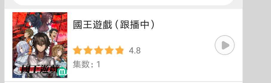
假设我们想要通过ConstraintLayout来实现下面的一个效果:

这是我从一款软件的列表界面,截取一个列表item样式。我们就通过ConstraintLayout来实现。先上代码:
<?xml version="1.0" encoding="utf-8"?>
<android.support.constraint.ConstraintLayout xmlns:android="http://schemas.android.com/apk/res/android"
    xmlns:app="http://schemas.android.com/apk/res-auto"
    android:layout_width="match_parent"
    android:layout_height="wrap_content">

    <ImageView
        android:id="@+id/photo"
        android:layout_width="100dp"
        android:layout_height="120dp"
        android:layout_marginStart="10dp"
        android:layout_marginTop="6dp"
        android:scaleType="fitXY"
        android:src="@drawable/aa"
        app:layout_constraintLeft_toLeftOf="parent"
        app:layout_constraintTop_toTopOf="parent" />

    <TextView
        android:id="@+id/item_title"
        android:layout_width="wrap_content"
        android:layout_height="wrap_content"
        android:layout_marginStart="10dp"
        android:layout_marginTop="4dp"
        android:text="国王游戏(跟播中)"
        android:textColor="#000"
	    android:textSize="20sp"
	                       app:layout_constraintLeft_toRightOf="@+id/photo"
	                                  app:layout_constraintTop_toTopOf="@+id/photo" />

    <com.example.constraintlayoutdemo.view.QxRatingBar
        android:id="@+id/rating"
        android:layout_width="113dp"
        android:layout_height="20dp"
        android:layout_marginTop="8dp"
        app:layout_constraintBottom_toBottomOf="parent"
        app:layout_constraintLeft_toLeftOf="@+id/item_title"
        app:layout_constraintTop_toTopOf="@+id/photo" />

    <TextView
        android:id="@+id/score"
        android:layout_width="wrap_content"
        android:layout_height="wrap_content"
        android:layout_marginStart="5dp"
        android:gravity="center"
        android:text="3.3"
        app:layout_constraintBottom_toBottomOf="@+id/rating"
        app:layout_constraintLeft_toRightOf="@+id/rating"
        app:layout_constraintTop_toTopOf="@+id/rating" />


    <TextView
        android:id="@+id/textView"
        android:layout_width="wrap_content"
        android:layout_height="wrap_content"
        android:text="集数:24"
        android:textColor="@android:color/darker_gray"
        android:textSize="18sp"
        app:layout_constraintBottom_toBottomOf="@+id/photo"
        app:layout_constraintLeft_toLeftOf="@+id/item_title" />

    <ImageView
        android:layout_width="45dp"
        android:layout_height="45dp"
        android:layout_marginEnd="15dp"
        android:src="@drawable/ic_play_circle_outline_grey_500_24dp"
        app:layout_constraintBottom_toBottomOf="parent"
        app:layout_constraintRight_toRightOf="parent"
        app:layout_constraintTop_toTopOf="parent" />
</android.support.constraint.ConstraintLayout>
通过上面的代码,我们实现如下效果:
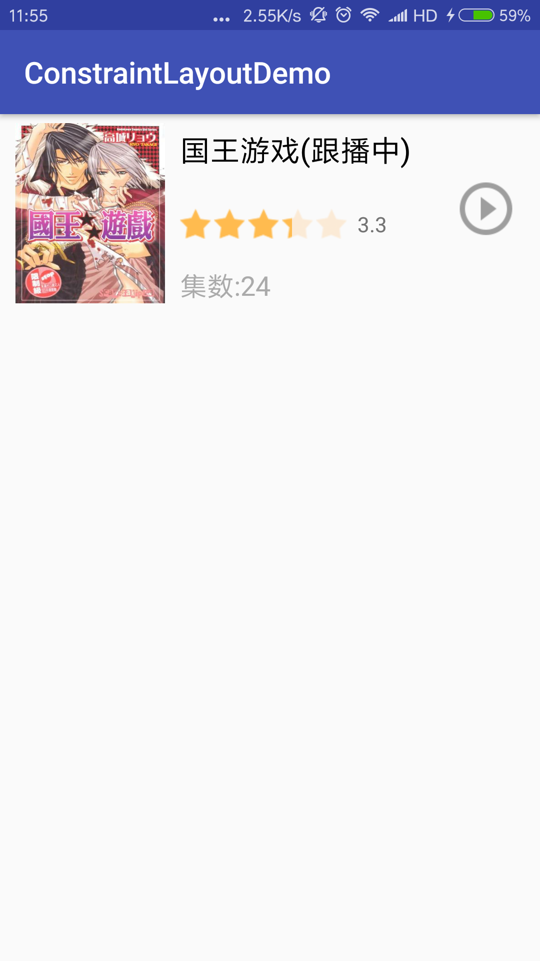
现在我们来解读下上面的代码是如何实现这种效果的。首先我们看到了ImageView中的:
app:layout_constraintLeft_toLeftOf="parent"
app:layout_constraintTop_toTopOf="parent"
这两行代码,这两行代码就是控制我们布局中控件的位置的,几乎每个控件都有,这个属性的字面意思很好理解,约束控件的左边在“parent”的左边,约束控件的上边在“parent”的上边。其实也就是约束控件的左边,上边和‘parent’的左边,上边对齐的意思。
那“parent”是什么呢?顾名思义,在这里就是ConstraintLayout。表示他的父布局。所以这两行代码也就控制了控件的位置:在ImageView位于布局的左上角。
下面再分析一下view id为item_title的TextView中使用。
app:layout_constraintLeft_toRightOf="@+id/photo"
app:layout_constraintTop_toTopOf="@+id/photo"
这两句的意思是,约束控件的左边在view id为photo的view的右边,约束控件的上边与view id为photo的view的上边对齐。
通过这两次的分析,大家可以细细体会一下。
类似的属性还有很多:
layout_constraintLeft_toLeftOf
layout_constraintLeft_toRightOf
layout_constraintRight_toLeftOf
layout_constraintRight_toRightOf
layout_constraintTop_toTopOf
layout_constraintTop_toBottomOf
layout_constraintBottom_toTopOf
layout_constraintBottom_toBottomOf
layout_constraintBaseline_toBaselineOf
layout_constraintStart_toEndOf
layout_constraintStart_toStartOf
layout_constraintEnd_toStartOf
layout_constraintEnd_toEndOf
这里我就不一一解释,已经解释过两次了,这些比较好理解,相信大家。
这类属性的作用。它是控制控件的位置的。和RelativeLayout有点像,但还是不一样的。
偏斜(Bias)
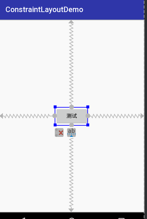
说到Bias,我们先提一下在ConstraintLayout如何实现居中效果。其实上面代码中有实现了居中效果的,我们来看下上面代码最后一个控件,这个ImageView表示播放按钮。
app:layout_constraintBottom_toBottomOf="parent"
app:layout_constraintTop_toTopOf="parent"
然后呢我们再看view id 为score的这个TextView,他是评分的意思,他也实现了居中效果,他是相对于那个星星控件垂直居中的。他的实现代码是:
app:layout_constraintBottom_toBottomOf="@+id/rating"
app:layout_constraintTop_toTopOf="@+id/rating"
通过这两处,大家应该发现规律了吧。对于播放按钮,代码意思是约束控件的下边和parent的下边一致(注意我这里的ConstraintLayout的height设置的是wrap_content),约束控件的上边和parent的上边一致。这可以形象的理解对于播放控件,在其上方,和下方有两个相同,反向的力在拉扯他,就像弹簧似的。因为力是均衡的,这就使得他处于中心位置。
就像下面这样:
<Button
        android:layout_width="wrap_content"
        android:layout_height="wrap_content"
        android:text="测试"
        app:layout_constraintBottom_toBottomOf="parent"
        app:layout_constraintTop_toTopOf="parent"
        app:layout_constraintRight_toRightOf="parent"
        app:layout_constraintLeft_toLeftOf="parent" />
居中的实现理解了,对与bias的特性也就好明白了。这种居中的效果是因为有反向相同的力。这个相同的弹力就是bias设置的。其实系统默认的bias是0.5,bias表示偏重,偏斜的意思,正是因为系统默认的0.5(百分之50)的设置,就不会有偏斜的作用。从而达到居中。看代码:
<Button
        android:layout_width="wrap_content"
        android:layout_height="wrap_content"
        android:text="button_one"
        app:layout_constraintLeft_toLeftOf="parent"
        app:layout_constraintRight_toRightOf="parent"
        app:layout_constraintHorizontal_bias="0.2"
        />
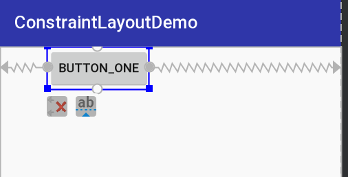
这是bias为0.2的效果。表示向button控件的左边施加了偏斜,使得button控件左边距离父控件左边的距离与button控件右边距离父控件右边的距离比为20%:80%。注意理解哦。
那这是水平方向的偏重我们是有app:layout_constraintHorizontal_bias属性。垂直方向的偏重我们使用layout_constraintVertical_bias属性。这两个属性默认的方向是左边和上方。
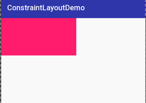
比例/率(Ratio)
这个属性是用来控制控件的宽和高的大小。使用ratio的前提是该控件至少有一个大小为0dp,在ConstraintLayout布局中0dp代表MATCH_CONSTRAINT,你可能会疑惑,不是match_parent嘛,怎么变match_constraint了,你没看错,在ConstraintLayout布局中摒弃了match_parent,使用了match_constraint来代替。
好,现在我们来看ratio的使用。
<TextView
        android:layout_width="200dp"
        android:layout_height="0dp"
        android:background="@color/colorAccent"
        app:layout_constraintDimensionRatio="2:1"
        app:layout_constraintLeft_toLeftOf="parent"
        app:layout_constraintTop_toTopOf="parent"
        />
这里app:layout_constraintDimensionRatio的值表示宽:高,这里也可以使用float的形式来表示宽高比。
还有一种表达形式如下:
<TextView
        android:layout_width="0dp"
        android:layout_height="0dp"
        android:background="@color/colorAccent"
        app:layout_constraintDimensionRatio="H,3:1"
        app:layout_constraintLeft_toLeftOf="parent"
        app:layout_constraintTop_toTopOf="parent"
        app:layout_constraintRight_toRightOf="parent"
        />
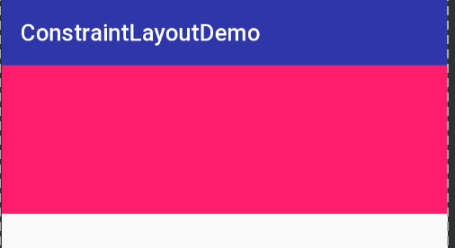
app:layout_constraintDimensionRatio属性的值是:“H,3:1”其中的H也可以改成W,具体根据情况来选择。两者的使用,大家可以多练习练习来体会一下,这里由于篇幅问题,就不说了。
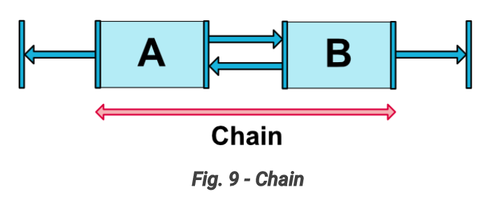
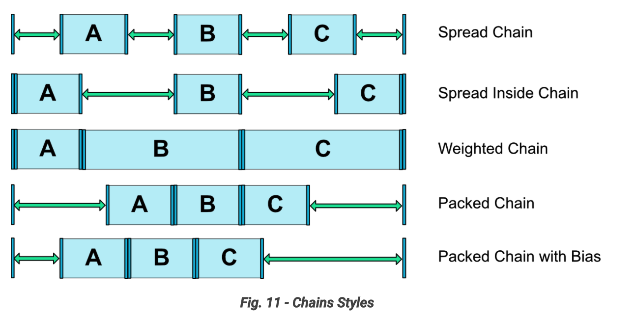
链(Chains)
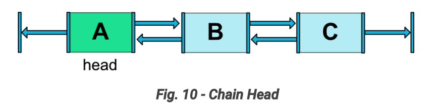
chains怎么说呢,给我的感觉就像是LinearLayout里面的weight属性似的,当然chains不是weight,他比weight强大。这里盗用一张官方图做解释吧:
chains最少有两个控件组成,像图中两两间构成约束,依赖的就构成了一个横向的chain。
先上代码:
<TextView
        android:id="@+id/bt_1"
        android:layout_width="0dp"
        android:layout_height="50dp"
        android:background="@color/colorAccent"
        android:text="button-one"
        app:layout_constraintBottom_toBottomOf="parent"
        app:layout_constraintLeft_toLeftOf="parent"
        app:layout_constraintRight_toLeftOf="@id/bt_2"
        app:layout_constraintHorizontal_weight="1"
        />

    <TextView
        android:id="@+id/bt_2"
        android:layout_width="0dp"
        android:layout_height="50dp"
        android:background="@color/colorPrimary"
        android:text="button-two"
        app:layout_constraintBottom_toBottomOf="parent"
        app:layout_constraintLeft_toRightOf="@id/bt_1"
        app:layout_constraintRight_toLeftOf="@id/bt_3"
        app:layout_constraintHorizontal_weight="1"/>

    <TextView
        android:id="@+id/bt_3"
        android:layout_width="0dp"
        android:layout_height="50dp"
        android:background="@android:color/holo_red_dark"
        android:text="button-three"
        app:layout_constraintBottom_toBottomOf="parent"
        app:layout_constraintLeft_toRightOf="@id/bt_2"
        app:layout_constraintRight_toRightOf="parent"
        app:layout_constraintHorizontal_weight="1"/>
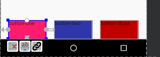
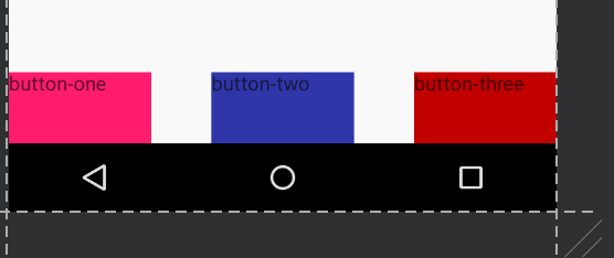
效果如下:
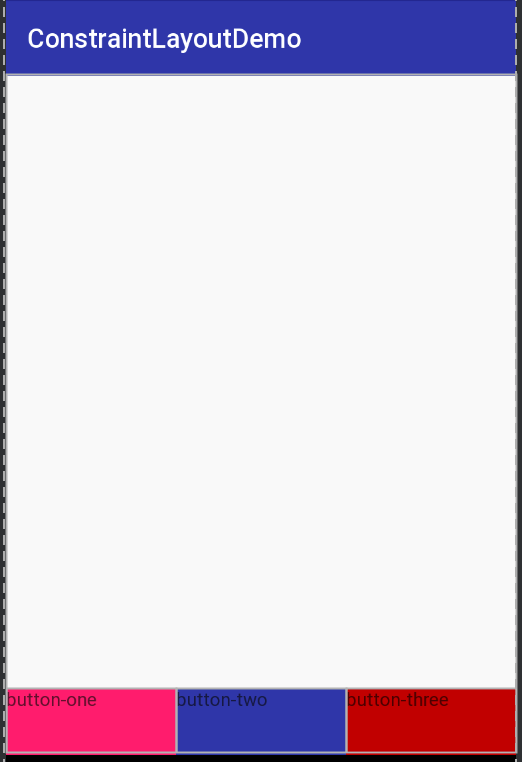
通过上面代码中的app:layout_constraintHorizontal_weight=”1″属性实现了三个控件均分整个宽度,这跟weight有点像,如果我们把button-one的app:layout_constraintHorizontal_weight值改为2,其余的还是1,我们看下效果:
看了你这你会觉得,这不就是weight么?还没结束呢,咱接着看。通过上面的代码啊,我们注意到这三个控件彼此都互相约束着,像button-one在two的左边,two在one右边这样。这种两两间彼此约束就构成了横向的链。
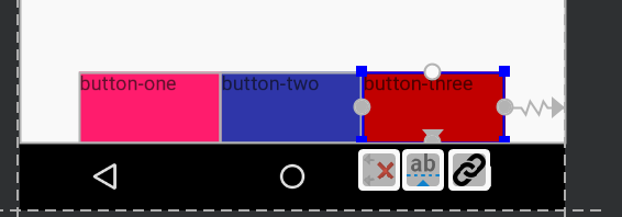
链中的第一个控件叫做chain head (链头)。如图:
我们可以在链头上添加layout_constraintHorizontal_chainStyle属性,实现不同的chainStyle效果。垂直方形的chain就使用layout_constraintVertical_chainStyle属性。
chainStyle有如下几种:
spread、spread inside、weighted、packed。
刚刚其实我们已经见过一种效果了,即按照weight等分,可以成为weighted chain。此时chainHead 设置chainStyle=”spread”,所有控件宽度设置为match_constraint(0dp),因为默认就是spread,所以我们没有显示设置。就是我们上面显示的效果。
下面看看packed、spread、spread inside。我们把控件的宽度由0dp改为一个确定的大小,如100dp。
style为packed:
style为spread:
style为spread inside:
其他的就不演示了,贴张官方图效果:
GuideLine
GuideLine 他是一条辅助线(直线),他是一个程序跑起来之后看不见的控件。
这里我们使用GuideLine来实现这样的布局:
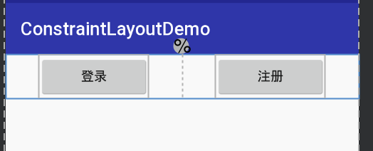
一个登录按钮,和一个注册按钮,他们的位置呢是处于布局的宽度一半的中间。
我们可以这样通过GuideLine来实现。
<?xml version="1.0" encoding="utf-8"?>
<android.support.constraint.ConstraintLayout
    xmlns:android="http://schemas.android.com/apk/res/android"
    xmlns:app="http://schemas.android.com/apk/res-auto"
    android:layout_width="match_parent"
    android:layout_height="wrap_content">

    <android.support.constraint.Guideline
        android:id="@+id/guide_line"
        android:layout_width="wrap_content"
        android:layout_height="wrap_content"
        android:orientation="vertical"
        app:layout_constraintGuide_percent="0.5"
        />

    <Button
        android:id="@+id/login"
        android:layout_width="120dp"
        android:layout_height="wrap_content"
        android:text="登录"
        app:layout_constraintLeft_toLeftOf="parent"
        app:layout_constraintRight_toLeftOf="@id/guide_line"
        />

    <Button
        android:id="@+id/register"
        android:layout_width="120dp"
        android:layout_height="wrap_content"
        android:text="注册"
        app:layout_constraintLeft_toRightOf="@id/guide_line"
        app:layout_constraintRight_toRightOf="parent"
        />

</android.support.constraint.ConstraintLayout>
这样就实现了上面的效果,代码中我们看到了GuideLine控件,我们注意这两个属性:
android:orientation=“vertical” app:layout_constraintGuide_percent=“0.5”
第一个属性好理解,是控制辅助线的方向,表明这是一条垂直的GuideLine。
第二个属性是控制GuideLine的位置的。表示GuideLine距离左边的距离为父控件宽度的百分之五十。如果orientation是水平的话,就是距离上面。
控制GuideLine位置的属性还有:
layout_constraintGuide_begin
layout_constraintGuide_end
layout_constraintGuide_percent
他们的意思都好理解,这边就不说了。
因为GuideLine是控件我们可以给其设置id,让他来约束其他控件,从而实现我们想要的效果。
通过这个例子我们看出来,GuideLine是作用确实巨大。
总结
通过上面对ConstraintLayout的特性介绍,我们发现ConstraintLayout的确实很强大,有能力实现扁平化的极致。他融合了RelativeLayout和LinearLayout的优点,比如相对位置,weight chains。并且他又多出来很多RelativeLayout和LinearLayout不具备的优点。所以说ConstraintLayout的掌握还是很有必要的。本篇博文的代码就不上传了。因为比较简单,自己操作一遍的话,就知道了。
参考文献
https://developer.android.com/reference/android/support/constraint/Guideline.html
https://developer.android.com/reference/android/support/constraint/ConstraintLayout.html#CenteringPositioning
http://blog.csdn.net/lmj623565791/article/details/78011599?utm_source=tuicool&utm_medium=referral
扫码加入我的个人微信公众号:Android开发圈 ,一起学习Android知识!!
扫码体验小程序:微捷径


发布者:全栈程序员-用户IM,转载请注明出处:https://javaforall.cn/137344.html原文链接:https://javaforall.cn
【正版授权,激活自己账号】: Jetbrains全家桶Ide使用,1年售后保障,每天仅需1毛
【官方授权 正版激活】: 官方授权 正版激活 支持Jetbrains家族下所有IDE 使用个人JB账号...