大家好,又见面了,我是你们的朋友全栈君。
原创文章,如有转载,请注明出处:http://blog.csdn.net/yihui823/article/details/6702312
线性布局。这个布局简单的说,就是所有控件都依次排序,谁也不会覆盖谁。线性布局需要定义一个方向,横向(android:orientation=”horizontal”)或纵向(android:orientation=”vertical”)。也就是说,控件要么就并排横向的排列,要么就纵向的笔直排列。
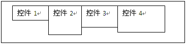
横向排列的示意图如下:layoutpic008

笔直排列的示意图如下:layoutpic009
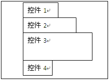
因为是并排放置的,所以不会有相互覆盖的情况出现。
我们把上一章的例子,稍加改动,仅仅把FrameLayout改成LinearLayout:
<?xml version=”1.0″ encoding=”utf-8″?>
<LinearLayout xmlns:android=”http://schemas.android.com/apk/res/android”
android:orientation=”vertical”
android:layout_width=”fill_parent”
android:layout_height=”fill_parent”
>
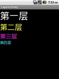
<TextView
android:id=”@+id/tv1″
android:layout_width=”fill_parent”
android:layout_height=”wrap_content”
android:textSize=”50dip”
android:textColor=”#ffffff”
android:text=”第一层”/>
<TextView
android:id=”@+id/tv2″
android:layout_width=”fill_parent”
android:layout_height=”wrap_content”
android:textSize=”40dip”
android:textColor=”#ffff00″
android:layout_toRightOf=”@id/tv1″
android:text=”第二层”/>
<TextView
android:id=”@+id/tv3″
android:layout_width=”wrap_content”
android:layout_height=”wrap_content”
android:textSize=”30dip”
android:textColor=”#ff00ff”
android:gravity=”right”
android:text=”第三层”/>
<TextView
android:id=”@+id/tv4″
android:layout_width=”fill_parent”
android:layout_height=”wrap_content”
android:textSize=”20dip”
android:textColor=”#00ffff”
android:layout_centerVertical=”true”
android:text=”第四层”/>
</LinearLayout>
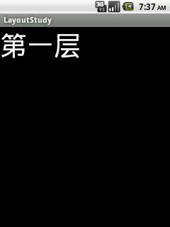
效果如下:layoutpic003
改动1
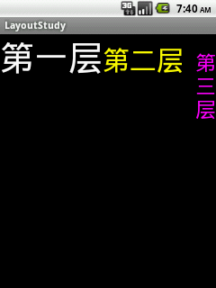
我们换成水平排列来看看。只改一行:
android:orientation=”horizontal”
效果如下:
layoutpic004
晕了有木有?是不是发现不对劲啊?搞不定了,先出去抽支烟再说。
哦,忘了我不抽烟的,呵呵。其实很简单,我们控件的属性:android:layout_width=”fill_parent”这就是说,第一个文本框的宽度就已经充满整个屏幕了,第二个文本框放在第一个文本框的右边,自然就看不到啦。
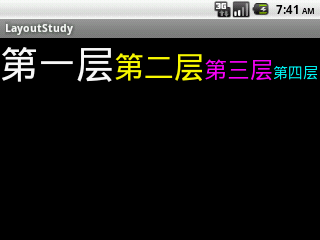
知道了原因,就改改。把四个文本框的宽度属性都改成:
android:layout_width=”wrap_content”
再看看效果:layoutpic005
嗯。因为文字太宽了,第三个文本框为了显示完全,成了多行显示的文本了。第四个文本框直接就消失在屏幕之外了。我们按下“Ctrl + F11”,把虚拟机横过来,就可以看到下图:
layoutpic006
改动2
保持横屏不动。我们尝试把第二个文本框改成:
<TextView
android:id=”@+id/tv2″
android:layout_width=”wrap_content”
android:layout_height=”wrap_content”
android:textSize=”40dip”
android:textColor=”#ffff00″
android:layout_below=”@id/tv1″
android:text=”第二层”/>
我们看看能不能让第二个文本框在第一个文本框的下面。显示结果表示:没变化。
改动3
我们尝试把第三个文本框改动下,加上边距:
<TextView
android:id=”@+id/tv3″
android:layout_width=”wrap_content”
android:layout_height=”wrap_content”
android:textSize=”30dip”
android:textColor=”#ff00ff”
android:gravity=”right”
android:layout_margin=”20dip”
android:text=”第三层”/>
看看有效果没?有的啊:
layoutpic007
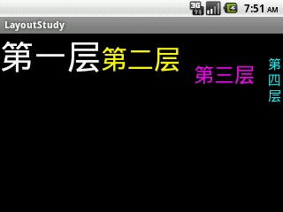
第三个文本框与其他控件以及父控件边缘,都保持了一定距离.(20dip不一定是20个像素哦,后面的文章我会仔细描述这个关系。)
总结
线性布局,同样没法直接控制控件的具体位置,以及相对的位置关系。每个控件都依次摆放。不过控件间的间距可以调整,控件也不会相互覆盖。线性布局可以嵌套使用,可以在一个纵向布局中加入一个横向布局。用这种嵌套方式,可以完成一些稍微复杂的页面。不过,当嵌套的情况使用的多了,并且嵌套的层次也多了,就会给维护带来非常大的麻烦。这个时候,就需要用更复杂的布局了。
发布者:全栈程序员-用户IM,转载请注明出处:https://javaforall.cn/137220.html原文链接:https://javaforall.cn
【正版授权,激活自己账号】: Jetbrains全家桶Ide使用,1年售后保障,每天仅需1毛
【官方授权 正版激活】: 官方授权 正版激活 支持Jetbrains家族下所有IDE 使用个人JB账号...